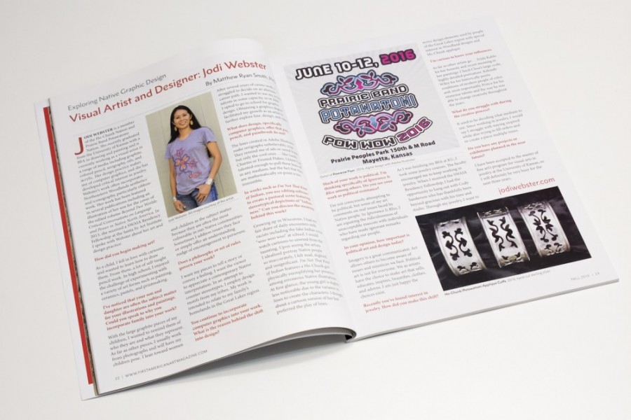
Matthew Ryan Smith, PhD interviews Jodi Webster (Ho-Chunk Nation/Prairie Band Potawatomi) as a guest writer for the Exploring Native Graphic Design column in the Fall 2016 issue of First American Art Magazine.
The Native Graphic Design Project
presented by Neebin Studios
Matthew Ryan Smith, PhD interviews Jodi Webster (Ho-Chunk Nation/Prairie Band Potawatomi) as a guest writer for the Exploring Native Graphic Design column in the Fall 2016 issue of First American Art Magazine.
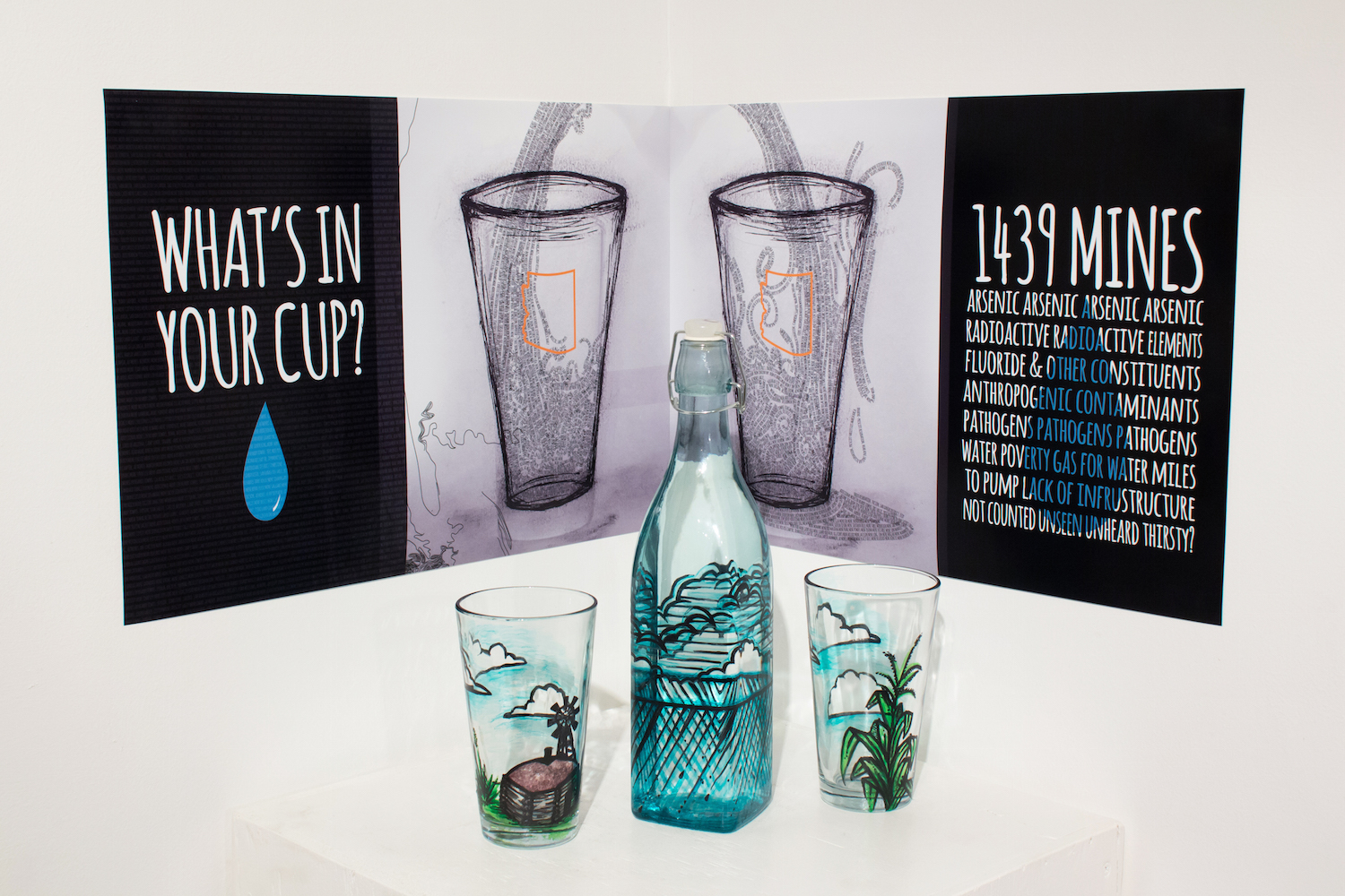
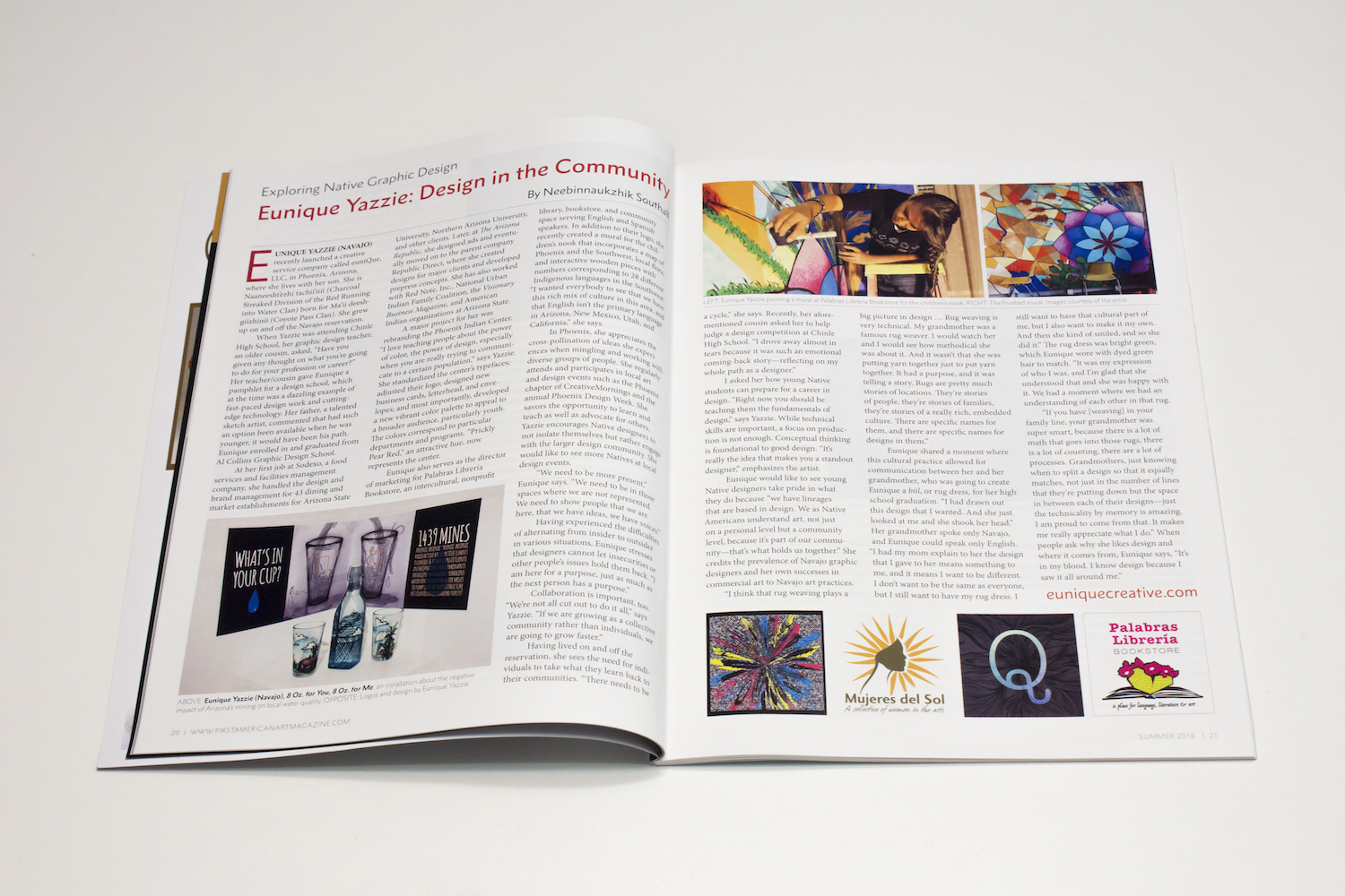
My article, Exploring Native Design: Eunique Yazzie: Design in the Community, featuring Phoenix-based Navajo designer Eunique Yazzie in issue no. 11, Summer 2016, of First American Art Magazine.
Eunique Yazzie: Design in the Community
by Neebinnaukzhik Southall
As appears in First American Art Magazine
EUNIQUE YAZZIE (NAVAJO) recently launched a creative service company called euniQue, LLC, in Phoenix, Arizona, where she lives with her son. She is Naaneesht’ezhi tachii’nii (Charcoal Streaked Division of the Red Running into Water Clan) born for Ma’ii deesh- giizhinii (Coyote Pass Clan). She grew up on and off the Navajo reservation.
When Yazzie was attending Chinle High School, her graphic design teacher, an older cousin, asked, “Have you given any thought on what you’re going to do for your profession or career?” Her teacher/cousin gave Eunique a pamphlet for a design school, which at the time was a dazzling example of fast-paced design work and cutting- edge technology. Her father, a talented sketch artist, commented that had such an option been available when he was younger, it would have been his path. Eunique enrolled in and graduated from Al Collins Graphic Design School.
At her first job at Sodexo, a food services and facilities management company, she handled the design and brand management for 43 dining and market establishments for Arizona State University, Northern Arizona University, and other clients. Later, at The Arizona Republic, she designed ads and eventually moved on to the parent company Republic Direct, where she created designs for major clients and developed prepress concepts. She has also worked with Red Note, Inc., National Urban Indian Family Coalition, the Visionary Business Magazine, and American Indian organizations at Arizona State.
A major project for her was rebranding the Phoenix Indian Center. “I love teaching people about the power of color, the power of design, especially when you are really trying to communicate to a certain population,” says Yazzie. She standardized the center’s typefaces; adjusted their logo; designed new business cards, letterhead, and envelopes; and most importantly, developed a new vibrant color palette to appeal to a broader audience, particularly youth. The colors correspond to particular departments and programs. “Prickly Pear Red,” an attractive hue, now represents the center.
Eunique also serves as the director of marketing for Palabras Librería Bookstore, an intercultural, nonprofit library, bookstore, and community space serving English and Spanish speakers. In addition to their logo, she recently created a mural for the children’s nook that incorporates a map of Phoenix and the Southwest, local flora, and interactive wooden pieces with numbers corresponding to 28 different Indigenous languages in the Southwest.
“I wanted everybody to see that we have this rich mix of culture in this area, and that English isn’t the primary language in Arizona, New Mexico, Utah, and California,” she says.
In Phoenix, she appreciates the cross-pollination of ideas she experiences when mingling and working with diverse groups of people. She regularly attends and participates in local art
and design events such as the Phoenix chapter of CreativeMornings and the annual Phoenix Design Week. She savors the opportunity to learn and teach as well as advocate for others. Yazzie encourages Native designers to not isolate themselves but rather engage with the larger design community. She would like to see more Natives at local design events.
“We need to be more present,” Eunique says. “We need to be in those spaces where we are not represented. We need to show people that we are here, that we have ideas, we have voices.”
Having experienced the difficulties of alternating from insider to outsider in various situations, Eunique stresses that designers cannot let insecurities or other people’s issues hold them back. “I am here for a purpose, just as much as the next person has a purpose.”
Collaboration is important, too. “We’re not all cut out to do it all,” says Yazzie. “If we are growing as a collective community rather than individuals, we are going to grow faster.”
Having lived on and off the reservation, she sees the need for individuals to take what they learn back to their communities. “There needs to be a cycle,” she says. Recently, her aforementioned cousin asked her to help judge a design competition at Chinle High School. “I drove away almost in tears because it was such an emotional coming-back story—reflecting on my whole path as a designer.”
I asked her how young Native students can prepare for a career in design. “Right now you should be teaching them the fundamentals of design,” says Yazzie. While technical skills are important, a focus on production is not enough. Conceptual thinking is foundational to good design. “It’s really the idea that makes you a standout designer,” emphasizes the artist.
Eunique would like to see young Native designers take pride in what they do because “we have lineages that are based in design. We as Native Americans understand art, not just on a personal level but a community level, because it’s part of our community—that’s what holds us together.” She credits the prevalence of Navajo graphic designers and her own successes in commercial art to Navajo art practices.
“I think that rug weaving plays a big picture in design … Rug weaving is very technical. My grandmother was a famous rug weaver. I would watch her and I would see how methodical she was about it. And it wasn’t that she was putting yarn together just to put yarn together. It had a purpose, and it was telling a story. Rugs are pretty much stories of locations. They’re stories of people, they’re stories of families, they’re stories of a really rich, embedded culture. There are specific names for them, and there are specific names for designs in them.”
Eunique shared a moment where this cultural practice allowed for communication between her and her grandmother, who was going to create Eunique a biil, or rug dress, for her high school graduation. “I had drawn out this design that I wanted. And she just looked at me and she shook her head.” Her grandmother spoke only Navajo, and Eunique could speak only English.
“I had my mom explain to her the design that I gave to her means something to me, and it means I want to be different. I don’t want to be the same as everyone, but I still want to have my rug dress. I still want to have that cultural part of me, but I also want to make it my own. And then she kind of smiled, and so she did it.” The rug dress was bright green, which Eunique wore with dyed green hair to match. “It was my expression of who I was, and I’m glad that she understood that and she was happy with it. We had a moment where we had an understanding of each other in that rug.
“If you have [weaving] in your family line, your grandmother was super smart, because there is a lot of math that goes into those rugs, there is a lot of counting, there are a lot of processes. Grandmothers, just knowing when to split a design so that it equally matches, not just in the number of lines that they’re putting down but the space in between each of their designs—just the technicality by memory is amazing. I am proud to come from that. It makes me really appreciate what I do.” When people ask why she likes design and where it comes from, Eunique says, “It’s in my blood. I know design because I saw it all around me.”
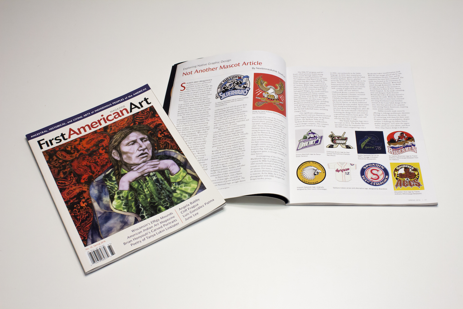
My article, Exploring Native Design: Not Another Mascot Article, which explores the intersection of Native peoples and sports in, I hope, a new way, by centering the discussion on positive design by both Native and non-Native designers. Issue no. 10, Spring 2016, of First American Art Magazine.
Not Another Mascot Article
by Neebinnaukzhik Southall
As appears in First American Art Magazine
SPORTS ARE UBIQUITOUS in Indian Country and beyond: basketball, hockey, lacrosse … Who hasn’t heard of rez ball? We have excellent Native athletes of all ages representing our people on both Native and non-Native teams at amateur and professional levels. Many of my relatives from Rama First Nation play sports.
There are plenty of die-hard fans to go around, too. Some proudly wear logos of their teams worked into beaded medallions. Like everyone else, Natives get into the rivalry. I know one sweet grandma from Cochiti Pueblo who yells at the TV when her teams are playing.
But most mainstream discussions about Native Americans and sports seem to revolve around negative depictions used in logos by non-Native teams. The effects of stereotypical and demeaning names, imagery, and chants have been widely debated. A less-considered aspect is how these names and images often fail from a design standpoint. What makes a good logo? Memorability, distinctiveness, simplicity, wide application, and relevancy. A good one isn’t trite, but for many sports logos that exist today, the same man may as well have posed
for all of them—with feathers in his braids or wearing a headdress, regardless of geographic region. And many teams have the same names: Warriors, Indians, Chiefs, and Braves (or worse!). Tomahawks and arrowheads abound. What I wouldn’t give to see a ball-headed war club! From a branding standpoint, these choices do not set these teams apart as distinctive or memorable. Hundreds of teams are guilty of this, mostly at the high school level, but even certain infamous professional teams lack unique branding. Native teams also fall into this trap.
Some conclude that all outsider references to Indigenous cultures are automatically wrong. Some refuse to acknowledge problems or make changes, conflating the bad with the good. Both ideas privilege ignorant choices as the only options. Referring to Native American cultures need not be problematic. I argue for greater incorporation of Native visuals in sports, not only for Native teams, but non-Native teams as well—in a knowledgeable, respectful, and design-savvy way, of course.
When it comes to incorporating cultural references to represent Native teams, the value is readily apparent. Many Native children begin playing sports at on-reservation schools. Virtually every tribe has at least one sports team. Sports can build self-esteem, confidence, perseverance, and even cultural pride.
From the young women’s Team Kivalliq hockey jerseys, which denote the inuksuk from the Nunavut flag, to a variety of team uniforms in the Little Native Hockey League in Ontario, to participants in basketball competitions across the continent, clear references are made to specific communities and cultures. Many jerseys include Indigenous patterns, borders, and other motifs. These teams serve as proud ambassadors of their communities.
In Native hands, even a Native mascot, if done right, can work as a representation of power and pride. The Iroquois Nationals logo, an eagle dancer, was designed by one of the founders, Oren Lyons (Onondaga Nation), a lacrosse player, painter, former commercial artist, traditional faithkeeper, and chief. Tracey Anthony (Mississauga-Delaware from Six Nations) has depicted strong Iroquois men in his designs, such as the Six Nations Rivermen logo. And Daryn Smith (Seneca) used the human form in his Seneca Warchiefs logo. All these emblems were created specifically for their communities. Certain uniforms strongly convey a sense of pride. The Iroquois teams often allude to the Iroquois flag. And why not? Lacrosse, an Indigenous game, is strongly rooted in their history.
A reimagining of the Chicago Blackhawks logo as a raptor instead of a person by Mike Ivall (Ojibwe) from 2007 recently resurfaced and made the rounds on social media, reaching millions of viewers. For many, it proved there are obvious alternatives when it comes to mascots. As for Mike, he is now a photographer with OHL Images and designs hockey jerseys.
The Nike N7 program and N7 Fund, which promote health among Native youth through athletics, has shown how a major sportswear company can collaborate with Native people. Nike employee Sam McCracken (Fort Peck Sioux-Assiniboine) was instrumental in its creation. While Nike could expand its efforts to include more Native designers and artists in the creation of their shoe and apparel designs, the visuals used have often resonated with Native communities. Several Native graphic designers have also done work for N7. At Oregon State University, my alma mater, the Beavers men’s basketball team, including Joe Burton (Soboba Luiseño), played with special turquoise N7 jerseys in 2010. In 2013, Nike released uniforms for
five NCAA basketball teams, including Oregon State.
One significant collaboration among Natives and non-Natives involved minor league baseball team the Spokane Indians, the Spokane Tribe of the Spokane Reservation, and Brandiose,
a sport design company. The company created two versions of a new logo in 2006, one exclusively in the Salish language. In 2014, they created jersey alternates for home games with the Salish word for Spokane, Sp’q’n’i, splashed across the chest and the Salish logo on the sleeve. These became the team’s primary home jerseys for 2015. Teams can build positive relationships rather than merely seek a stamp of approval from tribes.
In 2005, the now-defunct Chilliwack Bruins, a junior ice hockey team from British Columbia, recruited artist Stan Greene (Semiahmoo-Chehalis-Nez Perce) to design a shoulder patch with a stylized bear in honor of the Stó:lo Nation, on whose traditional homelands the team resided. Sports teams have strong local followings, and what says local more than Indigenous, after all? In 2010, the team released a third jersey featuring the design front and center at a special First Nations home game. The logo proved more visually iconic and relevant than their C logo.
The Seattle Seahawks logo was a hot topic in 2014. The Burke Museum speculated that the inspiration for the NFL team’s original logo was a Kwakwaka’wakw transformation mask. With the two images placed side by side, the resemblance became clear, and the inspiration has since been confirmed. The mask was located at the University of Maine’s Hudson Museum. With funds raised through Kickstarter, the Burke brought the mask to the museum to be exhibited in Here & Now: Native Artists Inspired. At the mask’s unveiling, artist and designer Andy Everson (Kwakwaka’wakw-K’ómoks) danced to welcome the mask. While the Seattle Seahawks have at times been criticized for using Northwest Coast formline instead of the Coast Salish design of the area, they have proved to be a popular team among Native Americans, inspiring many artistic renditions.
Adidas recently made waves by offering to redesign problematic identities for high schools. However, the caveat of contracting with them for three years for gear is likely cost prohibitive, despite interest. I challenge my fellow Native graphic designers: Let’s seize the opportunity, pitch our own talents, and show them what Native design is all about!
My article, Exploring Native Design: Rico Worl, featuring an interview iwth Tlingit/Athabaskan designer Rico Worl of Trickster Company in the Winter 2015/2016 issue of First American Art Magazine.
Rico Worl
by Neebinnaukzhik Southall
As appears in First American Art Magazine
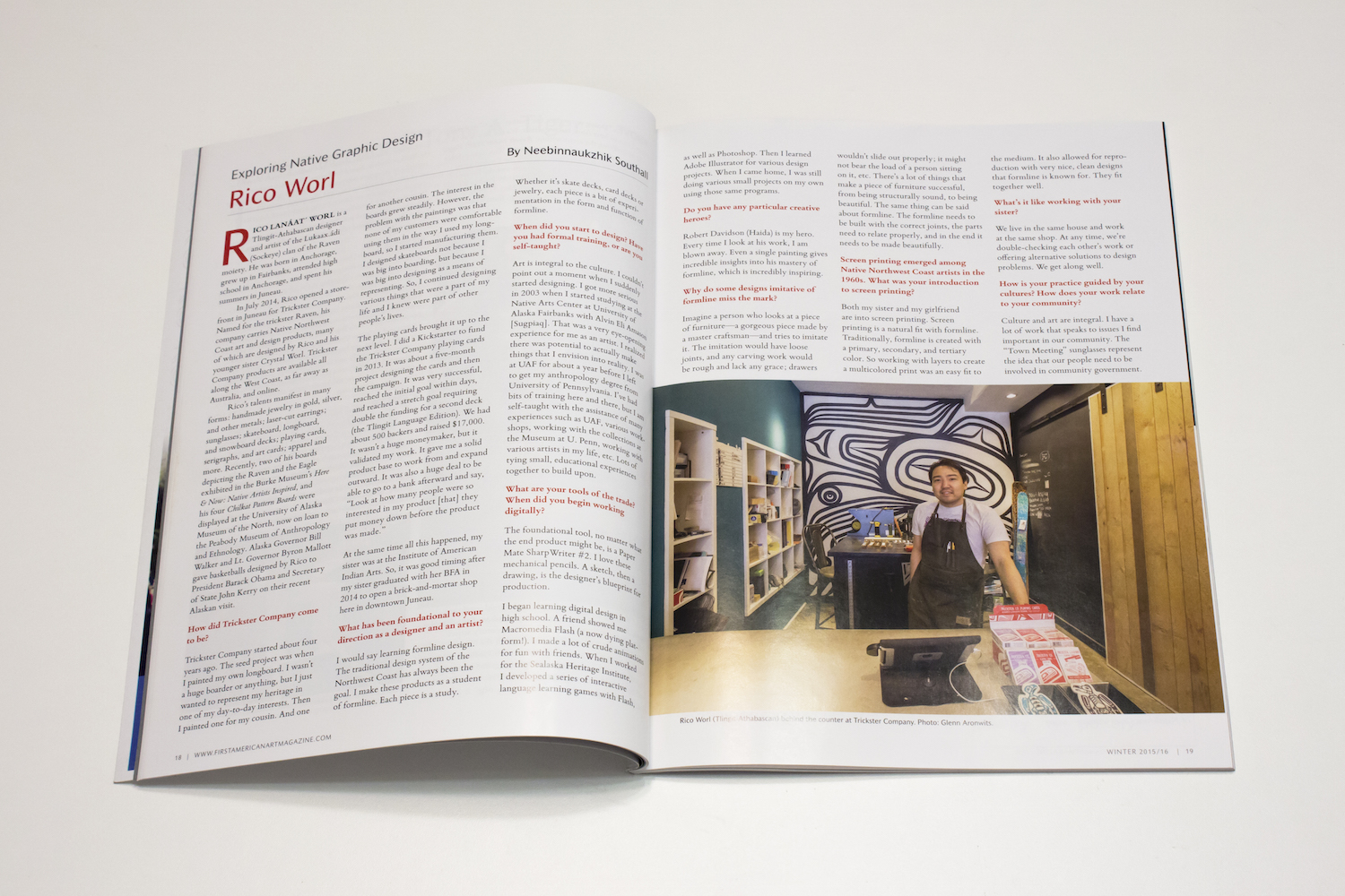
RICO LANÁAT ́ WORL is a Tlingit-Athabascan designer and artist of the Lukaax.ádi (Sockeye) clan of the Raven moiety. He was born in Anchorage, grew up in Fairbanks, attended high school in Anchorage, and spent his summers in Juneau.
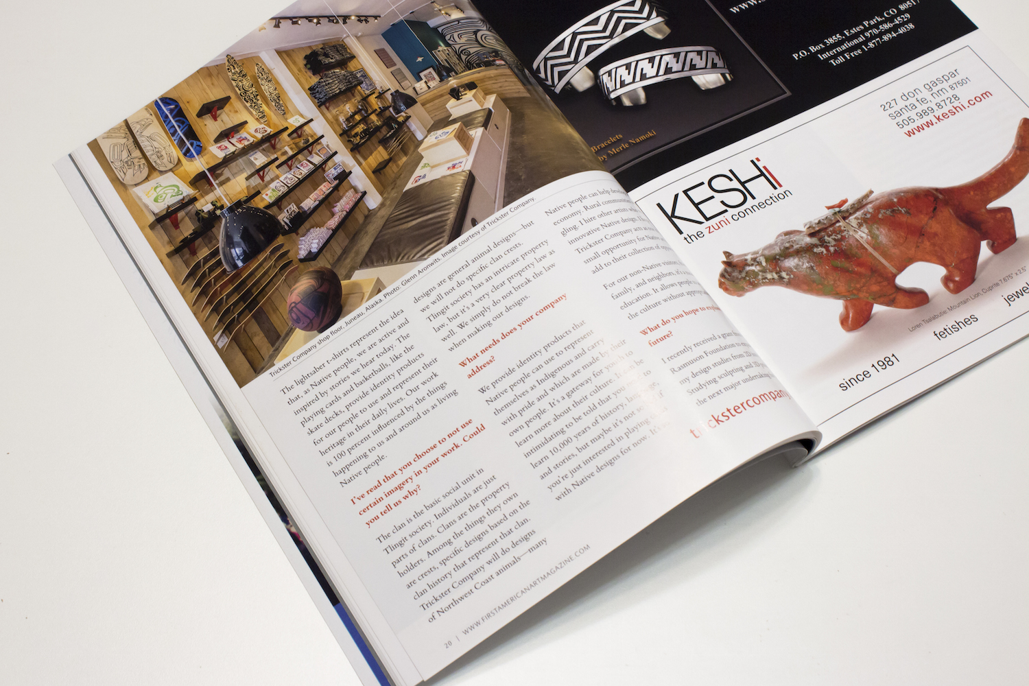
In July 2014, Rico opened a store- front in Juneau for Trickster Company. Named for the trickster Raven, his company carries Native Northwest Coast art and design products, many
of which are designed by Rico and his younger sister Crystal Worl. Trickster Company products are available all along the West Coast, as far away as Australia, and online.
Rico’s talents manifest in many forms: handmade jewelry in gold, silver, and other metals; laser-cut earrings; sunglasses; skateboard, longboard, and snowboard decks; playing cards, serigraphs, and art cards; apparel and more. Recently, two of his boards depicting the Raven and the Eagle exhibited in the Burke Museum’s Here & Now: Native Artists Inspired, and his four Chilkat Pattern Boards were displayed at the University of Alaska Museum of the North, now on loan to the Peabody Museum of Anthropology and Ethnology. Alaska Governor Bill Walker and Lt. Governor Byron Mallott gave basketballs designed by Rico to President Barack Obama and Secretary of State John Kerry on their recent Alaskan visit.
How did Trickster Company come to be?
Trickster Company started about four years ago. The seed project was when I painted my own longboard. I wasn’t a huge boarder or anything, but I just wanted to represent my heritage in one of my day-to-day interests. Then I painted one for my cousin. And one for another cousin. The interest in the boards grew steadily. However, the problem with the paintings was that none of my customers were comfortable using them in the way I used my longboard, so I started manufacturing them. I designed skateboards not because I was big into boarding, but because I was big into designing as a means of representing. So, I continued designing various things that were a part of my life and I knew were part of other people’s lives.
The playing cards brought it up to the next level. I did a Kickstarter to fund the Trickster Company playing cards in 2013. It was about a five-month project designing the cards and then the campaign. It was very successful, reached the initial goal within days, and reached a stretch goal requiring double the funding for a second deck (the Tlingit Language Edition). We had about 500 backers and raised $17,000. It wasn’t a huge moneymaker, but it validated my work. It gave me a solid product base to work from and expand outward. It was also a huge deal to be able to go to a bank afterward and say, “Look at how many people were so interested in my product [that] they put money down before the product was made.”
At the same time all this happened, my sister was at the Institute of American Indian Arts. So, it was good timing after my sister graduated with her BFA in 2014 to open a brick-and-mortar shop here in downtown Juneau.
What has been foundational to your direction as a designer and an artist?
I would say learning formline design. The traditional design system of the Northwest Coast has always been the goal. I make these products as a student of formline. Each piece is a study. Whether it’s skate decks, card decks or jewelry, each piece is a bit of experimentation in the form and function of formline.
When did you start to design? Have you had formal training, or are you self-taught?
Art is integral to the culture. I couldn’t point out a moment when I suddenly started designing. I got more serious in 2003 when I started studying at the Native Arts Center at University of Alaska Fairbanks with Alvin Eli Amason [Sugpiaq]. That was a very eye-opening experience for me as an artist. I realized there was potential to actually make things that I envision into reality. I was at UAF for about a year before I left to get my anthropology degree from University of Pennsylvania. I’ve had bits of training here and there, but I am self-taught with the assistance of many experiences such as UAF, various work- shops, working with the collections at the Museum at U. Penn, working with various artists in my life, etc. Lots of tying small, educational experiences together to build upon.
What are your tools of the trade? When did you begin working digitally?
The foundational tool, no matter what the end product might be, is a Paper Mate SharpWriter #2. I love these mechanical pencils. A sketch, then a drawing, is the designer’s blueprint for production.
I began learning digital design in high school. A friend showed me Macromedia Flash (a now dying platform!). I made a lot of crude animations for fun with friends. When I worked for the Sealaska Heritage Institute,
I developed a series of interactive language learning games with Flash, as well as Photoshop. Then I learned Adobe Illustrator for various design projects. When I came home, I was still doing various small projects on my own using those same programs.
Do you have any particular creative heroes?
Robert Davidson (Haida) is my hero. Every time I look at his work, I am blown away. Even a single painting gives incredible insights into his mastery of formline, which is incredibly inspiring.
Why do some designs imitative of formline miss the mark?
Imagine a person who looks at a piece of furniture—a gorgeous piece made by a master craftsman—and tries to imitate it. The imitation would have loose joints, and any carving work would be rough and lack any grace; drawers wouldn’t slide out properly; it might not bear the load of a person sitting on it, etc. There’s a lot of things that make a piece of furniture successful, from being structurally sound, to being beautiful. The same thing can be said about formline. The formline needs to be built with the correct joints, the parts need to relate properly, and in the end it needs to be made beautifully.
Screen printing emerged among Native Northwest Coast artists in the 1960s. What was your introduction to screen printing?
Both my sister and my girlfriend are into screen printing. Screen printing is a natural fit with formline. Traditionally, formline is created with a primary, secondary, and tertiary color. So working with layers to create a multicolored print was an easy fit to the medium. It also allowed for reproduction with very nice, clean designs that formline is known for. They fit together well.
What’s it like working with your sister?
We live in the same house and work at the same shop. At any time, we’re double-checking each other’s work or offering alternative solutions to design problems. We get along well.
How is your practice guided by your cultures? How does your work relate to your community?
Culture and art are integral. I have a lot of work that speaks to issues I find important in our community. The “Town Meeting” sunglasses represent the idea that our people need to be involved in community government. The lightsaber t-shirts represent the idea that, as Native people, we are active and inspired by stories we hear today. The playing cards and basketballs, like the skate decks, provide identity products for our people to use and represent their heritage in their daily lives. Our work is 100 percent influenced by the things happening to us and around us as living Native people.
I’ve read that you choose to not use certain imagery in your work. Could you tell us why?
The clan is the basic social unit in Tlingit society. Individuals are just parts of clans. Clans are the property holders. Among the things they own are crests, specific designs based on the clan history that represent that clan. Trickster Company will do designs of Northwest Coast animals—many designs are general animal designs—but we will not do specific clan crests. Tlingit society has an intricate property law, but it’s a very clear property law as well. We simply do not break the law when making our designs.
What needs does your company address?
We provide identity products that Native people can use to represent themselves as Indigenous and carry with pride and which are made by their own people. It’s a gateway for youth to learn more about their culture. It can be intimidating to be told that you need to learn 10,000 years of history, language, and stories, but maybe it’s not so bad if you’re just interested in playing cards with Native designs for now. It’s so Native people can help develop a Native economy. Rural communities are struggling. I hire other artists who represent innovative Native design. I hope that Trickster Company acts as one more small opportunity for Native artists to add to their collection of opportunities.
For our non-Native visitors, friends, family, and neighbors, it’s a means of education. It allows people to appreciate the culture without appropriating.
What do you hope to explore in the future?
I recently received a grant from the Rasmuson Foundation to expand my design studies from 2D into 3D. Studying sculpting and 3D printing is the next major undertaking for me.
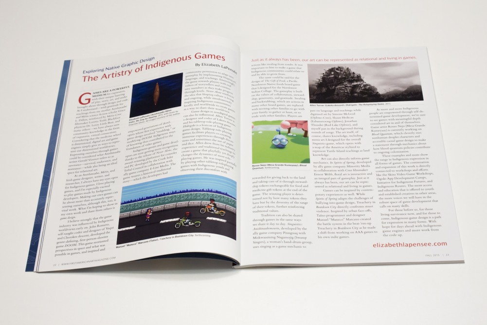
Elizabeth LaPensée steps into the Exploring Native Graphic Design column in issue no. 8, Fall 2015, for First American Art Magazine and brings Indigenous games to the spotlight.
My article, Exploring Native Design: Chad Earles: Caddo Visual Communicator, highlighting Caddo designer Chad Earles in issue 7, Summer 2015, of First American Art Magazine.
Chad Earles: Caddo Visual Communicator
by Neebinnaukzhik Southall
As appears in First American Art Magazine
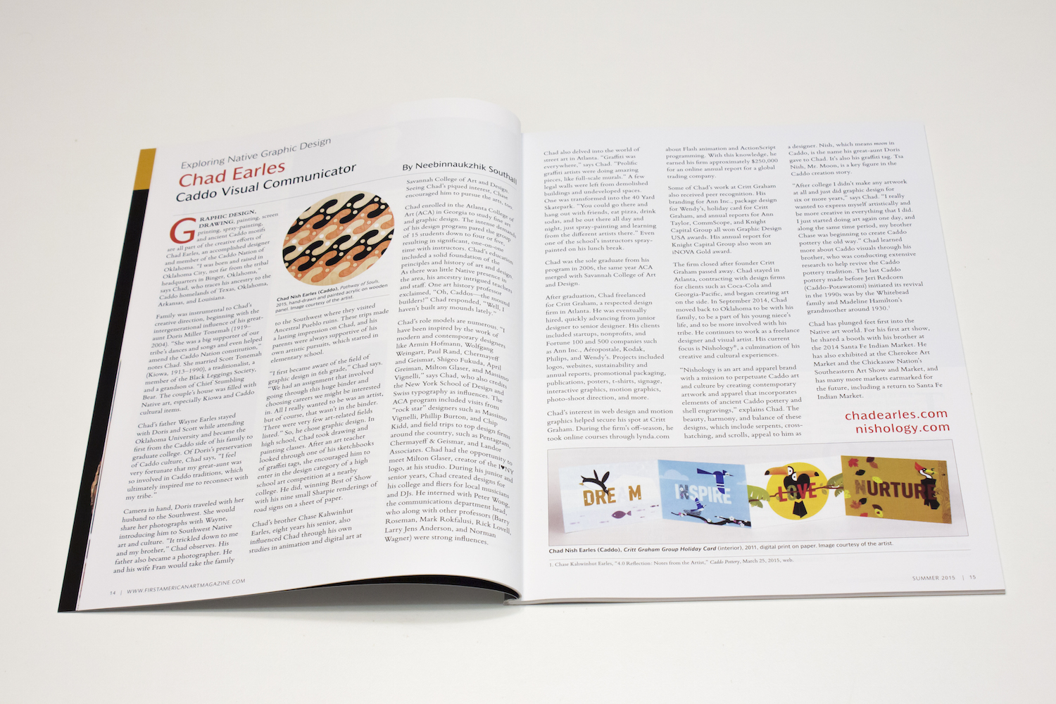
GRAPHIC DESIGN, DRAWING, painting, screen printing, spray-painting, and ancient Caddo motifs are all part of the creative efforts of Chad Earles, an accomplished designer and member of the Caddo Nation of Oklahoma. “I was born and raised in Oklahoma City, not far from the tribal headquarters in Binger, Oklahoma,” says Chad, who traces his ancestry to the Caddo homelands of Texas, Oklahoma, Arkansas, and Louisiana.
Family was instrumental to Chad’s creative direction, beginning with the intergenerational influence of his great- aunt Doris Miller Tonemah (1919– 2004). “She was a big supporter of our tribe’s dances and songs and even helped amend the Caddo Nation constitution,” notes Chad. She married Scott Tonemah (Kiowa, 1913–1990), a traditionalist, a member of the Black Leggings Society, and a grandson of Chief Stumbling Bear. The couple’s house was filled with Native art, especially Kiowa and Caddo cultural items.
Chad’s father Wayne Earles stayed with Doris and Scott while attending Oklahoma University and became the first from the Caddo side of his family to graduate college. Of Doris’s preservation of Caddo culture, Chad says, “I feel very fortunate that my great-aunt was
so involved in Caddo traditions, which ultimately inspired me to reconnect with my tribe.”
Camera in hand, Doris traveled with her husband to the Southwest. She would share her photographs with Wayne, introducing him to Southwest Native art and culture. “It trickled down to me and my brother,” Chad observes. His father also became a photographer. He and his wife Fran would take the family to the Southwest where they visited Ancestral Pueblo ruins. These trips made a lasting impression on Chad, and his parents were always supportive of his own artistic pursuits, which started in elementary school.
“I first became aware of the field of graphic design in 6th grade,” Chad says. “We had an assignment that involved going through this huge binder and choosing careers we might be interested in. All I really wanted to be was an artist, but of course, that wasn’t in the binder. There were very few art-related fields listed.” So, he chose graphic design. In high school, Chad took drawing and painting classes. After an art teacher looked through one of his sketchbooks of graffiti tags, she encouraged him to enter in the design category of a high school art competition at a nearby college. He did, winning Best of Show with his nine small Sharpie renderings of road signs on a sheet of paper.
Chad’s brother Chase Kahwinhut Earles, eight years his senior, also influenced Chad through his own studies in animation and digital art at Savannah College of Art and Design. Seeing Chad’s piqued interest, Chase encouraged him to pursue the arts, too.
Chad enrolled in the Atlanta College of Art (ACA) in Georgia to study fine art and graphic design. The intense demands of his design program pared the group of 15 students down to four or five, resulting in significant, one-on-one time with instructors. Chad’s education included a solid foundation of the principles and history of art and design. As there was little Native presence in the area, his ancestry intrigued teachers and staff. One art history professor exclaimed, “Oh, Caddos—the mound builders!” Chad responded, “Well, I haven’t built any mounds lately.”
Chad’s role models are numerous. “I have been inspired by the work of modern and contemporary designers like Armin Hofmann, Wolfgang Weingart, Paul Rand, Chermayeff
and Geismar, Shigeo Fukuda, April Greiman, Milton Glaser, and Massimo Vignelli,” says Chad, who also credits the New York School of Design and Swiss typography as influences. The ACA program included visits from “rock star” designers such as Massimo Vignelli, Phillip Burton, and Chip Kidd, and field trips to top design firms around the country, such as Pentagram, Chermayeff & Geismar, and Landor Associates. Chad had the opportunity to meet Milton Glaser, creator of the I♥NY logo, at his studio. During his junior and senior years, Chad created designs for his college and fliers for local musicians and DJs. He interned with Peter Wong, the communications department head, who along with other professors (Barry Roseman, Mark Rokfalusi, Rick Lovell, Larry Jens Anderson, and Norman Wagner) were strong influences.
Chad also delved into the world of street art in Atlanta. “Graffiti was everywhere,” says Chad. “Prolific graffiti artists were doing amazing pieces, like full-scale murals.” A few legal walls were left from demolished buildings and undeveloped spaces. One was transformed into the 40 Yard Skatepark. “You could go there and hang out with friends, eat pizza, drink sodas, and be out there all day and night, just spray-painting and learning from the different artists there.” Even one of the school’s instructors spray- painted on his lunch break.
Chad was the sole graduate from his program in 2006, the same year ACA merged with Savannah College of Art and Design.
After graduation, Chad freelanced for Critt Graham, a respected design firm in Atlanta. He was eventually hired, quickly advancing from junior designer to senior designer. His clients included startups, nonprofits, and Fortune 100 and 500 companies such as Ann Inc., Aéropostale, Kodak, Philips, and Wendy’s. Projects included logos, websites, sustainability and annual reports, promotional packaging, publications, posters, t-shirts, signage, interactive graphics, motion graphics, photo-shoot direction, and more.
Chad’s interest in web design and motion graphics helped secure his spot at Critt Graham. During the firm’s off-season, he took online courses through lynda.com about Flash animation and ActionScript programming. With this knowledge, he earned his firm approximately $250,000 for an online annual report for a global trading company.
Some of Chad’s work at Critt Graham also received peer recognition. His branding for Ann Inc., package design for Wendy’s, holiday card for Critt Graham, and annual reports for Ann Taylor, CommScope, and Knight Capital Group all won Graphic Design USA awards. His annual report for Knight Capital Group also won an iNOVA Gold award.
The firm closed after founder Critt Graham passed away. Chad stayed in Atlanta, contracting with design firms for clients such as Coca-Cola and Georgia-Pacific, and began creating art on the side. In September 2014, Chad moved back to Oklahoma to be with his family, to be a part of his young niece’s life, and to be more involved with his tribe. He continues to work as a freelance designer and visual artist. His current focus is Nishology®, a culmination of his creative and cultural experiences.
“Nishology is an art and apparel brand with a mission to perpetuate Caddo art and culture by creating contemporary artwork and apparel that incorporates elements of ancient Caddo pottery and shell engravings,” explains Chad. The beauty, harmony, and balance of these designs, which include serpents, cross- hatching, and scrolls, appeal to him as a designer. Nish, which means moon in Caddo, is the name his great-aunt Doris gave to Chad. It’s also his graffiti tag. Tsa Nish, Mr. Moon, is a key figure in the Caddo creation story.
“After college I didn’t make any artwork at all and just did graphic design for
six or more years,” says Chad. “I really wanted to express myself artistically and be more creative in everything that I did. I just started doing art again one day, and along the same time period, my brother Chase was beginning to create Caddo pottery the old way.” Chad learned more about Caddo visuals through his brother, who was conducting extensive research to help revive the Caddo pottery tradition. The last Caddo pottery made before Jeri Redcorn (Caddo-Potawatomi) initiated its revival in the 1990s was by the Whitebead family and Madeline Hamilton’s grandmother around 1930.
Chad has plunged feet first into the Native art world. For his first art show, he shared a booth with his brother at the 2014 Santa Fe Indian Market. He has also exhibited at the Cherokee Art Market and the Chickasaw Nation’s Southeastern Art Show and Market, and has many more markets earmarked for the future, including a return to Santa Fe Indian Market.
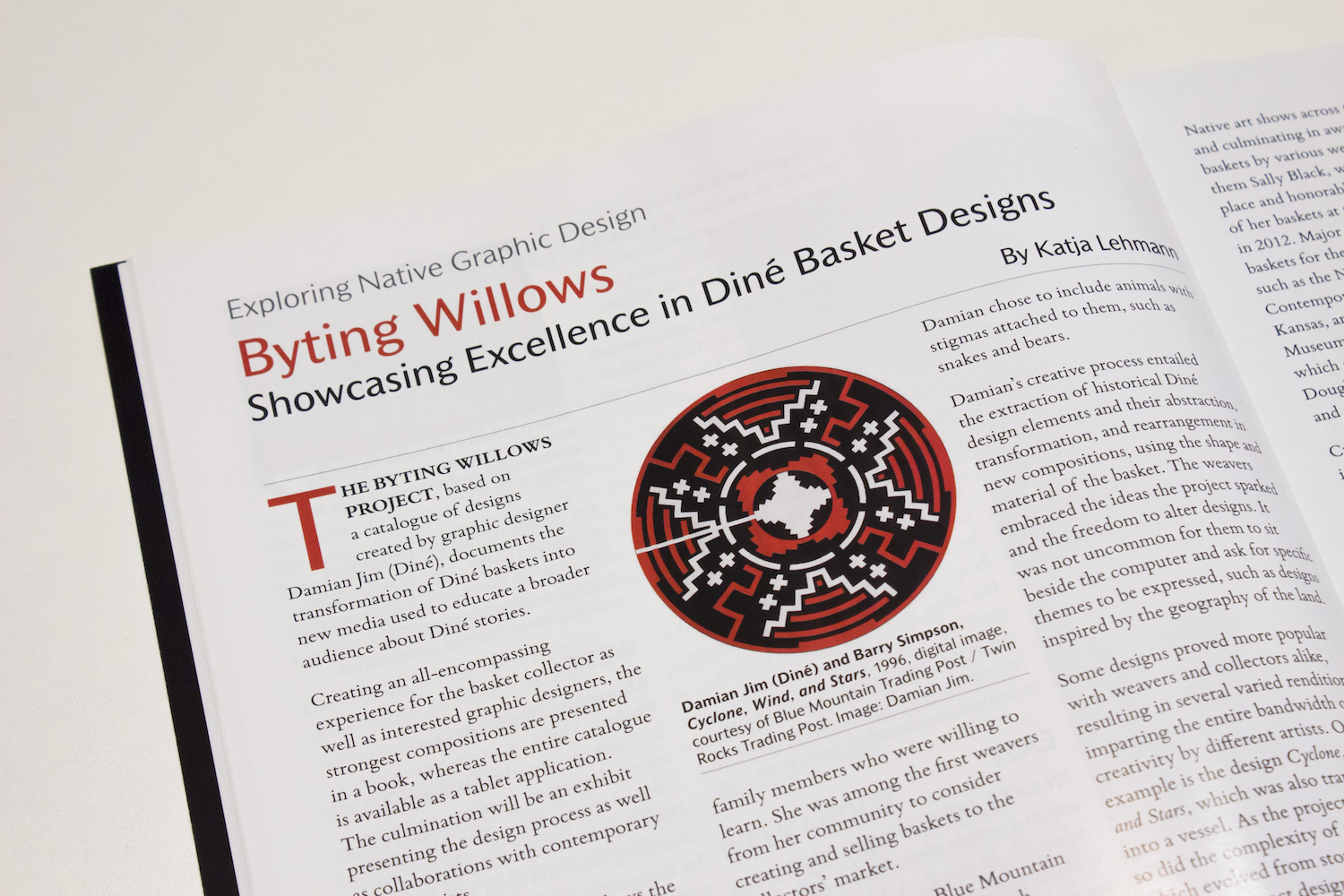
Katja Lehmann steps into the Exploring Native Graphic Design column in issue no 6, Spring 2015, for First American Art Magazine and highlights the Byting Willows project, which showcases excellence in Dine’ basket designs.
My article, Exploring Native Design: Publications Professional: Deborah Villa highlights the work of Mestiza designer Deborah Villa, appearing in the Winter 2014, issue 5 of First American Art Magazine.
Publications Professional: Deborah Villa
by Neebinnaukzhik Southall
As appears in First American Art Magazine
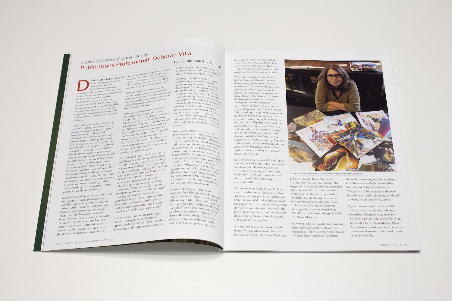
DEBORAH VILLA (Mestiza) is the creative powerhouse behind The Santa Fe
New Mexican’s specialty magazines. As the creative director and senior editor, she produces publications for Santa Fe’s major art markets: the Santa Fe Indian Market, the International Folk Art Market/Santa Fe, and Spanish Market. Additionally, she puts together a variety of other magazines throughout the year, such as Bienvenidos, Winterlife, and Health & Wellness.
Remarkably, she is the only person on staff creating these magazines. “I design the magazine from scratch,” states Deborah. Tasks include selecting fonts, designing style sheets, determining advertising placement, and picking covers to be approved by the publisher. “You have to be detail- oriented to do design,” says Deborah. The ability to organize and manage time is also important. The grid is vital to establishing structure in her design process. “I started designing using a 12-column grid,” Deborah explains, further noting that more columns allow for greater design flexibility. Deborah emphasizes that the paper, the press, the publication, and the story must be taken into account when designing. “When you’re working with newsprint versus glossy, it’s all about readability.”
In addition to design, her work involves art direction, hiring photographers and illustrators, designers, editors, and writers. After many years of covering diverse subject matter in the various magazines, she has a good sense of who’s who and what’s going on in Santa Fe. In the last few years, she has hired editors and directed editorial content. For the market magazines, she attends the shows and takes reference photos for future articles and potential artists to cover. “I work a year in advance on all the magazines,” says Deborah. “I [send] photographers out to all the markets to get photos for next year.”
Deborah’s level of expertise and big-picture insight comes as the result of a rich history of creative work and a storied life. Her grandmother on her father’s side was a fullblooded Indigenous woman from Torreón, Mexico.
Deborah, a self-described “child of the sixties,” grew up in the Logan Heights barrio in San Diego, California, where her family has lived for many generations. As the Vietnam War raged on, Deborah watched as her brothers and members of her community were drawn into the conflict. “All the people in my neighborhood were sent to war,” reveals Deborah. The disparities within these circumstances affected her outlook and influenced her decision to work as a graphic designer.
After hitchhiking around the country and living in a commune, Deborah put herself through school, first attending Adams State College, where she studied ceramics and printmaking. She received a grant from the National Endowment of the Arts in 1978 to work as an artist in residence teaching in the schools and community of San Luis, Colorado. There, she taught ceramics and drawing. In her work she explored drawing on porcelain with a glaze pencil and silk-screen printing on tile. Over time, she became disillusioned with the dynamics within the fine art world and “rebelled against fine art.”
“I did not want to do one painting so that only one person could buy it,” explains Deborah, bothered by the idea of catering to the elite to be successful. Preferring to create art that could be for everyone, she turned to printmaking, which led her to graphic design.
Desiring to fulfill a childhood dream of attending art school, Deborah moved to San Francisco to attend the Academy of Art University, where she graduated with a BFA in graphic design in the early 1980s. “I think the most valid thing I learned at school was typography,” says Deborah, noting that certain design techniques later became obsolete with the shift to computers. Every semester, she studied the history and nuances of type. “To me, it matters what fonts you use on different publications,” says Deborah. “You can tell an educated designer by their font choices.”
Inside and outside of school, San Francisco was an exciting place to be. “I was meeting people from all over the world,” says Deborah. Punk rock was in full swing, and the music and poster art of such bands as the Talking Heads had a major impression on her. She met and befriended Stanley Mouse, who notably designed posters and album covers for bands such as the Grateful Dead in the ‘60s. “When I was a teen I had his posters on my wall,” she reveals. With the drummer for Jefferson Airplane for a roommate, Deborah met a lot of musicians, including many she had admired in her younger years.
Music and design continued to intersect for Deborah as art director for Tower Records, where she designed advertising. “My office looked onto the San Francisco Bay.” Other work perks included “free tickets for everything” and backstage passes to shows. After Tower Records, she freelanced out of her apartment studio on Beach and Hyde Streets, producing work for nonprofit clients including Food First, Public Media Center, Mother Jones, and Greenpeace. Moving on, Deborah worked for Electronic Musician and Mix magazines for a few years in Berkeley.
“After the magazines, I got hired at the San Francisco Chronicle. I started doing newspaper features,” Deborah remembers. “We were working on the Macintosh and testing software for Adobe.” Designing on computers was then still new. On October 18, 1989, the Bay Area was hit with a major earthquake, and the electricity went out. “The back shop that put out the type couldn’t put it out,” tells Deborah. “We stayed up all night with a generator hooked up to the Macs and put the type out.” Using floppy disks from the writers, the art department printed out the columns of type, pasted them up, and successfully put together the paper. As a result of being part of the team that accomplished this feat, she was contracted as an art director by Apple in 1990, which had the earthquake edition of the paper hanging in their offices. Deborah also worked at the Oakland Tribune until it folded.
She left San Francisco in 1993 and spent a winter in Red Lodge, Montana, where she shared an office on Main Street with a former colleague from Apple Computer. Working from a distance, they explored telecommuting with clients in California.
“I came to Santa Fe in 1996,” Deborah says. “I walked in to The Santa Fe New Mexican with my portfolio.” Although Deborah intended to do freelance work, the paper’s features designer had quit the day before, and she was hired to fill the position. There she worked on the copy desk, designed features for the paper, and worked on magazines.
Around 2004, Deborah took a break from The New Mexican and headed back to California. At Desert Magazine, published by the Desert Sun in Palm Springs, she was hired to redesign the magazine. She art directed and managed photo shoots. Her first art direction project was on the red carpet with the Kirk Douglas family. She worked with photographers who shot food, architecture, fashion, and lifestyle photography. She was awarded an ADDY for publication design in 2005 for Desert Magazine.
However, a hostile work environment ultimately caused her to leave the magazine. “I left Palm Springs because of racial discrimination,” explains Deborah, recounting several incidents, including one in which the publisher himself stated that he didn’t want “Hispanics” in his magazine. She then moved on to Diablo Magazine, produced in Walnut Creek in the Bay Area.
Upon returning to Santa Fe in 2006, she has since focused on producing beautifully designed magazines for The New Mexican. On September 27th she headed to the New Mexico Press Association’s award banquet to receive a hard-earned award for her work on the 2014 Bienvenidos.
My article, Exploring Native Design: The Making of a Designer: Mark Rutledge is a biography of the Yukon-based Ojibwe designer Mark Rutledge, appearing in the Fall 2014, issue 4 of First American Art Magazine.
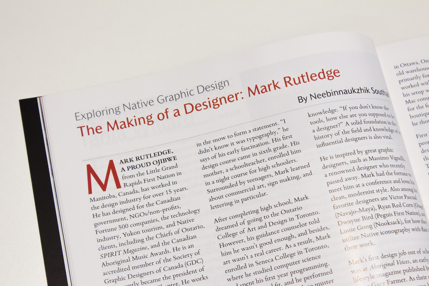
The Making of a Designer: Mark Rutledge
by Neebinnaukzhik Southall
As appears in First American Art Magazine
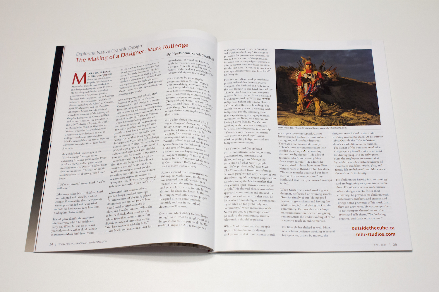
MARK RUTLEDGE, A PROUD OJIBWE from the Little Grand Rapids First Nation in Manitoba, Canada, has worked in the design industry for over 15 years. He has designed for the Canadian government, NGOs/non-profits, Fortune 500 companies, the technology industry, Yukon tourism, and Native clients, including the Chiefs of Ontario, SPIRIT Magazine, and the Canadian Aboriginal Music Awards. He is an accredited member of the Society of Graphic Designers of Canada (GDC) and recently became the president of the GDC’s Arctic Chapter. He works at Outside the Cube in Whitehorse, Yukon, where he lives with his wife Tracy—a fellow designer he met in college—and their three children. Mark’s successful career results from an adventurous and at times tumultuous journey.
As a child Mark was caught in the “Sixties Scoop,” a tragic period extending from the 1960s to the 1980s in which the Canadian government stole thousands of Native children from their communities. The start of his life was brutal—at an abusive group foster home.
“We’re survivors,” asserts Mark. “We’re still here.”
Like many other Native children, Mark was adopted and raised by a white couple. Fortunately, these new parents were open-minded and never tried to hide his heritage or keep him from finding his Native family.
His adoptive family also nurtured his creativity, which he exhibited early on. When he was six or seven years old—while other children built snowmen—Mark built letterforms in the snow to form a statement. “I didn’t know it was typography,” he says of his early fascination. His first design course came in sixth grade. His mother, a schoolteacher, enrolled him in a night course for high schoolers. Surrounded by teenagers, Mark learned about commercial art, sign making, and lettering in particular.
After completing high school, Mark dreamed of going to the Ontario College of Art and Design in Toronto. However, his guidance counselor told him he wasn’t good enough, and besides, art wasn’t a real career. As a result, Mark enrolled in Seneca College in Toronto, where he studied computer science and spent his first year programming. It wasn’t a good fit, and he performed poorly. It took him a week to muster up the courage to tell his dad he was failing. Rather than being angry, his dad suggested Mark take graphic design instead. Seneca College was actually one of the first programs in the area to offer a degree in design. Mark enrolled the next year, and his computer experience proved to beneficial. “I had an edge on the other kids because I knew how a computer worked,” explains Mark. While admitting he wasn’t good at something was difficult, he sees failure as a necessary step to improvement. “Everyone fails. How are you supposed to become successful if you don’t fail?”
When Mark first went to school, graphic design involved paste-ups (an arrangement of physically placed illustrations and text on paper), blue-lines (proofs printed in shades of blue), and film for printing. When the industry shifted, Mark went back to school to further immerse himself in digital, online, and interactive media. “You have to evolve with the field,” stresses Mark, and maintain a thirst for knowledge. “If you don’t know the tools, how else are you supposed to be a designer?” A solid foundation in the history of the field and knowledge of its influential designers is also vital.
He is inspired by great graphic designers, such as Massimo Vignelli, a renowned designer who sadly recently passed away. Mark had the fortune to meet him at a conference and loves his clean, modernist style. Also among his favorite designers are Victor Pascual (Navajo-Mayan), Ryan Red Corn (Osage), Dwayne Bird (Peguis First Nation), and Louie Gong (Nooksack), in how they utilize Native iconography with flair in their work.
Mark’s first design job out of school was at Aboriginal Voices, an early Native lifestyle magazine published by Cayuga actor Gary Farmer. As their only designer, for a year or two he laid out the magazine late into the night in a “swanky office” in an old building on Queen Street in the fashion district in the core of downtown Toronto. The location was happening and work atmosphere exciting. “I met all these famous Indians,” enthuses Mark, such as Cree musician Buffy Sainte-Marie, as well as many Native actors.
Rumors spread that the magazine was folding, so Mark started job-hunting and received two offers—a fashion magazine and the student administration at Ryerson University. Despite loving fashion, he chose the latter. At Ryerson, he mingled with other young people, designed diverse communication material, and was in the hub of downtown Toronto.
Over time, Mark didn’t feel challenged enough, so in 1998 he sought work at a design studio to sharpen his skills. The studio, Hangar 13 Art & Design, was in Ottawa, Ontario. Back in “another old warehouse building,” he primarily designed for government agencies. He worked with a team of designers, and his setup was cutting-edge—working a Mac computer with two huge monitors for the first time. “I wanted to work at a boutique design studio, and here I am!” he thought.
First Nations client work poured in as people realized that he was a Native designer. The husband-and-wife team that ran Hangar 13 and Mark formed the Thunderbird Group, a sister company to serve Native clients. Mark developed branding inspired by WWI and WWII Indigenous fighter pilots to fit Hangar 13’s aircraft-influenced branding. The couple was very open to working with Indigenous people, stemming from their experiences growing up in small communities, living on reserve, and having Native friends. Mark’s time working with them was a mutually beneficial and educational relationship. “There is a way for us to understand each other in a good way,” asserts Mark, regarding Indigenous and non-Indigenous interactions.
The Thunderbird Group hired Native consultants, including writers, photographers, historians, and elders, and sought to “change the perception of what Native people are. We’re professionals,” says Mark. The Thunderbird Group was a bridge between people—not only designing but also educating. Mark taught corporations wanting to tap the Native market that they couldn’t just “throw money at the people.” He showed clients how to best approach communities and stressed the importance of respect. In that vein, he hates when “non-Indigenous companies try to latch on for profit only, not community,” when interacting with Native groups. A percentage should go back to the community, and the relationship should be positive.
While Mark is honored that people approach him due to his diverse background and skill set, clients should not expect the stereotypical. Clients have requested feathers, dreamcatchers, sweetgrass, and the four directions. There are other icons and concepts. “There’s more to communication than the first idea,” says Mark, stressing the need to dig deeper. “I do a lot of research,” says Mark. “I don’t know everything about every culture.” He admits he was surprised to learn how many First Nations were in British Columbia alone. “We want to make you stand out from the rest of your competition,” says Mark, and that is why a nuanced concept is vital.
When Mark first started working as a designer, he focused on winning awards. Now it’s simply about “doing good design for great clients and having fun while doing it.” And giving back to the community. He provides workshops on communication, focused on giving remote artists the understanding of what it takes to reach an online market.
His lifestyle has shifted as well. Mark relates his experience working at several big agencies; driven by money, the designers were locked in the studio, working around the clock. At his current job at Outside the Cube in Yukon, there’s a stark difference in outlook. The owner of the company worked at a large agency herself and sees no need for driving people to an early grave. Here the employees are surrounded by wilderness, a beautiful landscape of mountains and lakes. Work, play, and family life are balanced, and Mark walks the trails with his family.
His children are heavily into technology and are beginning to appreciate what he does. His oldest son now understands what a designer is. To foster their creativity, he provides his children with watercolors, markers, and crayons and brings home printouts of his work that they can draw over. He encourages them to not compare themselves to other artists and tells them, “You’re being creative, and that’s what counts.”

My article, Exploring Native Design: Perspectives from Ryan Red Corn, in which I present the perspectives of prominent Osage designer Ryan Red Corn, in the Summer 2014, issue 3 of First American Art Magazine.
Perspectives from Ryan Red Corn
by Neebinnaukzhik Southall
As appears in First American Art Magazine
OSAGE GRAPHIC DESIGNER Ryan Red Corn’s accomplishments are many and varied. He co-founded the design and marketing company Buffalo Nickel Creative (www.buffalonickelcreative.com), whose clients include Nike and NMAI; operates Red Corn Native Foods; shoots videos and performs for the Native comedy group, the 1491s (www.1491s.com); launched Demockratees, a successful line of edgy political t-shirts; and serves as the co-executive director of NVision, a Native youth media arts group. Recently, I had a chance to speak with Ryan and hear his perspectives as a designer working with Native communities.
Having Access
Ryan Red Corn’s creative foundations began early. With a mother studying graphic design and a father working in carpentry, he had many opportunities for hands-on learning at a very young age. He often accompanied his mother to classes, and at home, with access to the tools of the trade, he graphed letters and used darkroom equipment.
His father traded a drum set for a computer, and the family got CorelDRAW, which Ryan used extensively as a young teen. He also grew up with the visual aesthetics of his tribe, participating in ceremonies and having many artists in the family.
During high school, Red Corn took design classes at the Shawnee Mission District vocational school, and, in junior college, he majored in graphic design.
He transferred to the nearby University of Kansas, at the time listed among the top five places to learn graphic design. While at school, Ryan jokes he started “doing more freelance than homework.” In 2003, he graduated with a BFA in Visual Communications and has been designing since.
Realizing how important access has been to his own journey as a graphic designer, Ryan, who has two daughters, aged one and three, included his older daughter in his work. She sits on his lap while he is designing and editing. He often brings her to photo shoots and lets her hold his camera. He lets her take a few pictures, so the equipment does not intimidate her.
When his daughters grow up, Ryan says, “They can do whatever they want.” They may not turn out to be designers, photographers, or videographers, but they will have the confidence to use the technology if they so desire. Most importantly, he wants them to be able to use their imagination, to use their hands, and to tell stories.
Indigenization for Problem Solving
Noting how “everyone talks about decolonization,” Ryan Red Corn critiques what he feels is an inadequate approach to solving issues in Indian Country. At various Native American studies conferences, he noticed that discussions of decolonization often end up using the same languages, tools, and intellectual frameworks that were introduced by colonialism to try to academically solve problems.
To address issues, Native people have adopted bureaucratic solutions, such
as the grant process and compiling and assessing data (working from what Ryan calls a “resource allocation perspective”), which Ryan feels are ineffectual for social healing. For example, a community receives a grant for dealing with domestic violence or suicide. A few billboards are designed with disturbing imagery and a hotline. What are the psychological effects on the community members driving by those billboards?
Ryan sees these tactics form a negative narrative for the community’s identity. These tactics do not ultimately positively affect the people within that community or even address the problems.
Indigenization, by contrast, is a “radically different approach to the problem,” using Native cultural ways of thinking. Instead of dealing with pieces and the “remainder of the equation,” he suggests affecting the whole via “social maintenance.” This can mean holding ceremonies, making sure community gymnasiums stay open, or creating positive media. Noting how many kids use iPhones, Ryan strives to use his profession to “create as much digestible content as possible.”
Laughter as Medicine
In his 20s, Ryan’s work was charged with anger, but he shifted his approach and “started to dabble with comedy and humor in messaging.” In 2009, his friend Sterlin Harjo (Seminole- Muscogee Creek) and he were in Santa Fe, New Mexico, for the 9th Annual Native Cinema Showcase, where Sterlin showed his film Barking Water, featuring Ryan in a comic relief scene. During the screening, Ryan watched the crowd during his scene. The crowd roared with laughter, in stark contrast to the backdrop of the film festival, filled with all-too-common themes of death, addiction, and abuse. It demonstrated the “amount of power in Indian humor,” the power in laughter that is “much more powerful than the crying,” says Ryan, that is “absent from so many portions of the media.”
“Humor is a higher form of intelligence,” Ryan explains. Comedy has the unique potential to tackle social issues and grip people. Ryan compares using humor to deliver a message to the paring down of visual information to create an effective logo. People think that a “hard problem needs to be solved with a lot of lines and details,” and yet, it’s the simple answer that works best.
Taking Ownership of Our Spaces
For Hidden Voices, Coded Words, an Oklahoma code-talkers exhibit, none of the posters Ryan designed used English. For a Native conference, he put 20 ways to say “hello” in different Indigenous languages in the front of the program booklet.
When tribes commission him to design t-shirts, Ryan strongly encourages them to use their languages and minimize English. When these shirts and images are worn in the community, they are seen over and over and become part of the visual vocabulary of those people.
While creating work for his own community, Ryan incorporated the Osage alphabet into his designs. “Only a small amount of people can read [it], but it’s ours.” These design choices are an act of visual sovereignty. We have the power to make decisions about our spaces, to make them our own, rather than have them merely be an extension of someone else’s viewpoints. Many “don’t realize we have inherent power in that space,” says Ryan. Our own cultures can instead be front and center in our designed space, which is crucial given how surroundings affect our sense of self and reality.
Languages carry worldviews. “The language is the whole—the key to constructing that entire environment,” states Ryan. The Osage word for praying contains the idea of borrowing, with the expectation of giving something in return. Osage also has specific words for the precise relationships within a family tree. Considering the values embedded in language, not only is it important to preserve spoken language, but to preserve visual language as well. Images “continue to exist after people don’t know what they mean.”
Using Native Iconography
Native visual conventions are actual languages rather than simple decoration. Osage ribbonwork has a wealth of meaning within colors and designs. Responsibilities come with working with Native imagery—learning the meanings of symbols, securing permission for use when necessary, and being careful with small yet important details. The design piece should “look like it came from that community” and be in harmony with its aesthetics. While certain components can be put together in atypical ways, it’s important to do it in such a way so that the “community is willing not only to accept but proliferate” that design.
Working with Native visual culture required new ways of thinking and designing for Ryan, expanding his working vocabulary. “That process has created for me a new language–a new visual language,” says Red Corn. He credits Woody Crumbo (Potawatomi), whom he met as a kid, and Acee Blue Eagle (Pawnee-Muscogee-Wichita) as influences in their integration of particular Native visual conventions in their paintings.
Native Designers Needed
While it may sound counterintuitive of him as a business owner, Ryan would like to see more Natives become graphic designers. For one, Ryan describes himself as being “super competitive.” Seeing other Natives creating good work pushes him to do better. Secondly, without access to talented people, he is limited in expanding his own company. He doesn’t have much Native competition when vying for Native- related projects, but he wishes he did, since he’s often up against non-native designers lacking in cultural fluency. When more Native people are trained within their communities, clients aren’t limited to superficial results. The designers are empowered to use and even alter their visual vocabularies in relevant, organic ways, in keeping with their own communities’ decisions.