Exploring Native Graphic Design: The Making of a Designer: Mark Rutledge

the_making_of_a_designer_mark_rutledgethe_making_of_a_designer_mark_rutledge_2

My article, Exploring Native Design: The Making of a Designer: Mark Rutledge is a biography of the Yukon-based Ojibwe designer Mark Rutledge, appearing in the Fall 2014, issue 4 of First American Art Magazine.


The Making of a Designer: Mark Rutledge
by Neebinnaukzhik Southall
As appears in First American Art Magazine

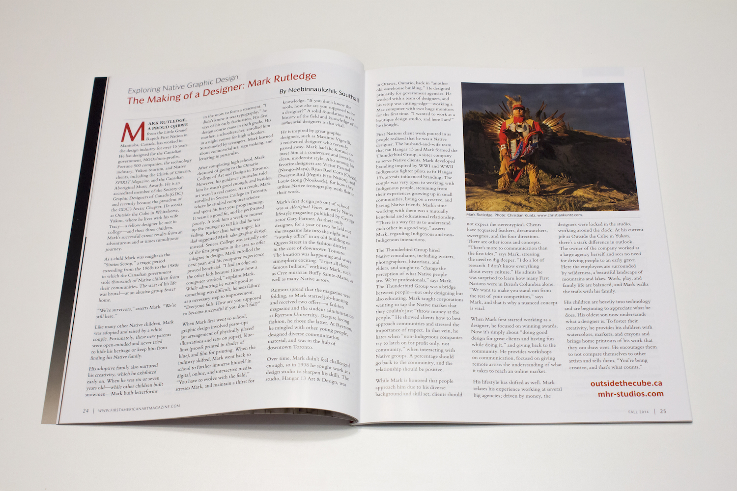
MARK RUTLEDGE, A PROUD OJIBWE from the Little Grand Rapids First Nation in Manitoba, Canada, has worked in the design industry for over 15 years. He has designed for the Canadian government, NGOs/non-profits, Fortune 500 companies, the technology industry, Yukon tourism, and Native clients, including the Chiefs of Ontario, SPIRIT Magazine, and the Canadian Aboriginal Music Awards. He is an accredited member of the Society of Graphic Designers of Canada (GDC) and recently became the president of the GDC’s Arctic Chapter. He works at Outside the Cube in Whitehorse, Yukon, where he lives with his wife Tracy—a fellow designer he met in college—and their three children. Mark’s successful career results from an adventurous and at times tumultuous journey.

As a child Mark was caught in the “Sixties Scoop,” a tragic period extending from the 1960s to the 1980s in which the Canadian government stole thousands of Native children from their communities. The start of his life was brutal—at an abusive group foster home.

“We’re survivors,” asserts Mark. “We’re still here.”

Like many other Native children, Mark was adopted and raised by a white couple. Fortunately, these new parents were open-minded and never tried to hide his heritage or keep him from finding his Native family.

His adoptive family also nurtured his creativity, which he exhibited early on. When he was six or seven years old—while other children built snowmen—Mark built letterforms in the snow to form a statement. “I didn’t know it was typography,” he says of his early fascination. His first design course came in sixth grade. His mother, a schoolteacher, enrolled him in a night course for high schoolers. Surrounded by teenagers, Mark learned about commercial art, sign making, and lettering in particular.

After completing high school, Mark dreamed of going to the Ontario College of Art and Design in Toronto. However, his guidance counselor told him he wasn’t good enough, and besides, art wasn’t a real career. As a result, Mark enrolled in Seneca College in Toronto, where he studied computer science and spent his first year programming. It wasn’t a good fit, and he performed poorly. It took him a week to muster up the courage to tell his dad he was failing. Rather than being angry, his dad suggested Mark take graphic design instead. Seneca College was actually one of the first programs in the area to offer a degree in design. Mark enrolled the next year, and his computer experience proved to beneficial. “I had an edge on the other kids because I knew how a computer worked,” explains Mark. While admitting he wasn’t good at something was difficult, he sees failure as a necessary step to improvement. “Everyone fails. How are you supposed to become successful if you don’t fail?”

When Mark first went to school, graphic design involved paste-ups (an arrangement of physically placed illustrations and text on paper), blue-lines (proofs printed in shades of blue), and film for printing. When the industry shifted, Mark went back to school to further immerse himself in digital, online, and interactive media. “You have to evolve with the field,” stresses Mark, and maintain a thirst for knowledge. “If you don’t know the tools, how else are you supposed to be a designer?” A solid foundation in the history of the field and knowledge of its influential designers is also vital.

He is inspired by great graphic designers, such as Massimo Vignelli, a renowned designer who sadly recently passed away. Mark had the fortune to meet him at a conference and loves his clean, modernist style. Also among his favorite designers are Victor Pascual (Navajo-Mayan), Ryan Red Corn (Osage), Dwayne Bird (Peguis First Nation), and Louie Gong (Nooksack), in how they utilize Native iconography with flair in their work.

Mark’s first design job out of school was at Aboriginal Voices, an early Native lifestyle magazine published by Cayuga actor Gary Farmer. As their only designer, for a year or two he laid out the magazine late into the night in a “swanky office” in an old building on Queen Street in the fashion district in the core of downtown Toronto. The location was happening and work atmosphere exciting. “I met all these famous Indians,” enthuses Mark, such as Cree musician Buffy Sainte-Marie, as well as many Native actors.

Rumors spread that the magazine was folding, so Mark started job-hunting and received two offers—a fashion magazine and the student administration at Ryerson University. Despite loving fashion, he chose the latter. At Ryerson, he mingled with other young people, designed diverse communication material, and was in the hub of downtown Toronto.

Over time, Mark didn’t feel challenged enough, so in 1998 he sought work at a design studio to sharpen his skills. The studio, Hangar 13 Art & Design, was in Ottawa, Ontario. Back in “another old warehouse building,” he primarily designed for government agencies. He worked with a team of designers, and his setup was cutting-edge—working a Mac computer with two huge monitors for the first time. “I wanted to work at a boutique design studio, and here I am!” he thought.

First Nations client work poured in as people realized that he was a Native designer. The husband-and-wife team that ran Hangar 13 and Mark formed the Thunderbird Group, a sister company to serve Native clients. Mark developed branding inspired by WWI and WWII Indigenous fighter pilots to fit Hangar 13’s aircraft-influenced branding. The couple was very open to working with Indigenous people, stemming from their experiences growing up in small communities, living on reserve, and having Native friends. Mark’s time working with them was a mutually beneficial and educational relationship. “There is a way for us to understand each other in a good way,” asserts Mark, regarding Indigenous and non-Indigenous interactions.

The Thunderbird Group hired Native consultants, including writers, photographers, historians, and elders, and sought to “change the perception of what Native people are. We’re professionals,” says Mark. The Thunderbird Group was a bridge between people—not only designing but also educating. Mark taught corporations wanting to tap the Native market that they couldn’t just “throw money at the people.” He showed clients how to best approach communities and stressed the importance of respect. In that vein, he hates when “non-Indigenous companies try to latch on for profit only, not community,” when interacting with Native groups. A percentage should go back to the community, and the relationship should be positive.

While Mark is honored that people approach him due to his diverse background and skill set, clients should not expect the stereotypical. Clients have requested feathers, dreamcatchers, sweetgrass, and the four directions. There are other icons and concepts. “There’s more to communication than the first idea,” says Mark, stressing the need to dig deeper. “I do a lot of research,” says Mark. “I don’t know everything about every culture.” He admits he was surprised to learn how many First Nations were in British Columbia alone. “We want to make you stand out from the rest of your competition,” says Mark, and that is why a nuanced concept is vital.

When Mark first started working as a designer, he focused on winning awards. Now it’s simply about “doing good design for great clients and having fun while doing it.” And giving back to the community. He provides workshops on communication, focused on giving remote artists the understanding of what it takes to reach an online market.

His lifestyle has shifted as well. Mark relates his experience working at several big agencies; driven by money, the designers were locked in the studio, working around the clock. At his current job at Outside the Cube in Yukon, there’s a stark difference in outlook. The owner of the company worked at a large agency herself and sees no need for driving people to an early grave. Here the employees are surrounded by wilderness, a beautiful landscape of mountains and lakes. Work, play, and family life are balanced, and Mark walks the trails with his family.

His children are heavily into technology and are beginning to appreciate what he does. His oldest son now understands what a designer is. To foster their creativity, he provides his children with watercolors, markers, and crayons and brings home printouts of his work that they can draw over. He encourages them to not compare themselves to other artists and tells them, “You’re being creative, and that’s what counts.”

outsidethecube.ca

mhr-studios.com

Exploring Native Graphic Design: Perspectives from Ryan Red Corn

Ryan Red Corn

My article, Exploring Native Design: Perspectives from Ryan Red Corn, in which I present the perspectives of prominent Osage designer Ryan Red Corn, in the Summer 2014, issue 3 of First American Art Magazine.


Perspectives from Ryan Red Corn
by Neebinnaukzhik Southall
As appears in First American Art Magazine

OSAGE GRAPHIC DESIGNER Ryan Red Corn’s accomplishments are many and varied. He co-founded the design and marketing company Buffalo Nickel Creative (www.buffalonickelcreative.com), whose clients include Nike and NMAI; operates Red Corn Native Foods; shoots videos and performs for the Native comedy group, the 1491s (www.1491s.com); launched Demockratees, a successful line of edgy political t-shirts; and serves as the co-executive director of NVision, a Native youth media arts group. Recently, I had a chance to speak with Ryan and hear his perspectives as a designer working with Native communities.

Having Access

Ryan Red Corn’s creative foundations began early. With a mother studying graphic design and a father working in carpentry, he had many opportunities for hands-on learning at a very young age. He often accompanied his mother to classes, and at home, with access to the tools of the trade, he graphed letters and used darkroom equipment.

His father traded a drum set for a computer, and the family got CorelDRAW, which Ryan used extensively as a young teen. He also grew up with the visual aesthetics of his tribe, participating in ceremonies and having many artists in the family.

During high school, Red Corn took design classes at the Shawnee Mission District vocational school, and, in junior college, he majored in graphic design.

He transferred to the nearby University of Kansas, at the time listed among the top five places to learn graphic design. While at school, Ryan jokes he started “doing more freelance than homework.” In 2003, he graduated with a BFA in Visual Communications and has been designing since.

Realizing how important access has been to his own journey as a graphic designer, Ryan, who has two daughters, aged one and three, included his older daughter in his work. She sits on his lap while he is designing and editing. He often brings her to photo shoots and lets her hold his camera. He lets her take a few pictures, so the equipment does not intimidate her.

When his daughters grow up, Ryan says, “They can do whatever they want.” They may not turn out to be designers, photographers, or videographers, but they will have the confidence to use the technology if they so desire. Most importantly, he wants them to be able to use their imagination, to use their hands, and to tell stories.

Indigenization for Problem Solving

Noting how “everyone talks about decolonization,” Ryan Red Corn critiques what he feels is an inadequate approach to solving issues in Indian Country. At various Native American studies conferences, he noticed that discussions of decolonization often end up using the same languages, tools, and intellectual frameworks that were introduced by colonialism to try to academically solve problems.

To address issues, Native people have adopted bureaucratic solutions, such
as the grant process and compiling and assessing data (working from what Ryan calls a “resource allocation perspective”), which Ryan feels are ineffectual for social healing. For example, a community receives a grant for dealing with domestic violence or suicide. A few billboards are designed with disturbing imagery and a hotline. What are the psychological effects on the community members driving by those billboards?

Ryan sees these tactics form a negative narrative for the community’s identity. These tactics do not ultimately positively affect the people within that community or even address the problems.

Indigenization, by contrast, is a “radically different approach to the problem,” using Native cultural ways of thinking. Instead of dealing with pieces and the “remainder of the equation,” he suggests affecting the whole via “social maintenance.” This can mean holding ceremonies, making sure community gymnasiums stay open, or creating positive media. Noting how many kids use iPhones, Ryan strives to use his profession to “create as much digestible content as possible.”

Laughter as Medicine

In his 20s, Ryan’s work was charged with anger, but he shifted his approach and “started to dabble with comedy and humor in messaging.” In 2009, his friend Sterlin Harjo (Seminole- Muscogee Creek) and he were in Santa Fe, New Mexico, for the 9th Annual Native Cinema Showcase, where Sterlin showed his film Barking Water, featuring Ryan in a comic relief scene. During the screening, Ryan watched the crowd during his scene. The crowd roared with laughter, in stark contrast to the backdrop of the film festival, filled with all-too-common themes of death, addiction, and abuse. It demonstrated the “amount of power in Indian humor,” the power in laughter that is “much more powerful than the crying,” says Ryan, that is “absent from so many portions of the media.”

“Humor is a higher form of intelligence,” Ryan explains. Comedy has the unique potential to tackle social issues and grip people. Ryan compares using humor to deliver a message to the paring down of visual information to create an effective logo. People think that a “hard problem needs to be solved with a lot of lines and details,” and yet, it’s the simple answer that works best.

Taking Ownership of Our Spaces

For Hidden Voices, Coded Words, an Oklahoma code-talkers exhibit, none of the posters Ryan designed used English. For a Native conference, he put 20 ways to say “hello” in different Indigenous languages in the front of the program booklet.

When tribes commission him to design t-shirts, Ryan strongly encourages them to use their languages and minimize English. When these shirts and images are worn in the community, they are seen over and over and become part of the visual vocabulary of those people.

While creating work for his own community, Ryan incorporated the Osage alphabet into his designs. “Only a small amount of people can read [it], but it’s ours.” These design choices are an act of visual sovereignty. We have the power to make decisions about our spaces, to make them our own, rather than have them merely be an extension of someone else’s viewpoints. Many “don’t realize we have inherent power in that space,” says Ryan. Our own cultures can instead be front and center in our designed space, which is crucial given how surroundings affect our sense of self and reality.

Languages carry worldviews. “The language is the whole—the key to constructing that entire environment,” states Ryan. The Osage word for praying contains the idea of borrowing, with the expectation of giving something in return. Osage also has specific words for the precise relationships within a family tree. Considering the values embedded in language, not only is it important to preserve spoken language, but to preserve visual language as well. Images “continue to exist after people don’t know what they mean.”

Using Native Iconography

Native visual conventions are actual languages rather than simple decoration. Osage ribbonwork has a wealth of meaning within colors and designs. Responsibilities come with working with Native imagery—learning the meanings of symbols, securing permission for use when necessary, and being careful with small yet important details. The design piece should “look like it came from that community” and be in harmony with its aesthetics. While certain components can be put together in atypical ways, it’s important to do it in such a way so that the “community is willing not only to accept but proliferate” that design.

Working with Native visual culture required new ways of thinking and designing for Ryan, expanding his working vocabulary. “That process has created for me a new language–a new visual language,” says Red Corn. He credits Woody Crumbo (Potawatomi), whom he met as a kid, and Acee Blue Eagle (Pawnee-Muscogee-Wichita) as influences in their integration of particular Native visual conventions in their paintings.

Native Designers Needed

While it may sound counterintuitive of him as a business owner, Ryan would like to see more Natives become graphic designers. For one, Ryan describes himself as being “super competitive.” Seeing other Natives creating good work pushes him to do better. Secondly, without access to talented people, he is limited in expanding his own company. He doesn’t have much Native competition when vying for Native- related projects, but he wishes he did, since he’s often up against non-native designers lacking in cultural fluency. When more Native people are trained within their communities, clients aren’t limited to superficial results. The designers are empowered to use and even alter their visual vocabularies in relevant, organic ways, in keeping with their own communities’ decisions.

Exploring Native Graphic Design: Design in Academic Settings

Exploring Native Design: Design in Academic Settings

My article, Exploring Native Design: Design in Academic Settings, in the Spring 2014 issue 2 of First American Art Magazine.


Design in Academic Settings
by Neebinnaukzhik Southall
As appears in First American Art Magazine

ON HUNDREDS OF COLLEGE CAMPUSES every term, a flurry of activity within Native student clubs and associations, cultural centers, and academic programs, presents an opportunity for Native-made design. For every student group, a chance for a logo exists. For every powwow, guest speaker, community gathering, or other event, a flier or poster needs to be made. And indeed, a wealth of Native-made design on campuses can be found, created by amateurs and budding professionals alike.

Designs involving Native imagery serve an important role in campus settings where, aside from entities such as tribal colleges, Native students and faculty are often a small minority. By and large, such schools can be culturally alienating – references to Indigenous cultures and people are few and far between. In a social climate where Native people have been long misrepresented, where nuances in Indigenous visual meanings are not part of the mainstream cultural vocabulary, Natives designing for and representing Natives is a needed form of self-agency and empowerment.

Even in more inclusive settings, good design by Natives for Natives provides a sense of familiarity, community, and understanding; serves as a visual refuge; and operates as a source of pride. Design can serve as an important reinforcement of identity – for example, a logo for a Native student association essentially represents those students and carries emotional weight as well. Designing for one’s Native community builds meaningful connections and is a way for individuals to use their skills to give back to the community as well as speak for themselves as Native people.

For beginning or student designers looking to put their design chops to the test, campus settings provide a good opportunity to do so. While I don’t generally wave around the often-exploitative phrase “it will build your portfolio,” designing within the campus setting is a good way to get your feet wet and has its benefits, in spite of low to no budgets. The creative freedom to experiment exists with relatively low risk involved. A more personal connection and passion for the subject matter, in tandem with skill, can produce some very good work. Having your work seen in public or having even hundreds of people attend an event thanks to a design you created is rewarding and encouraging. For those wishing to do future work for Native entities, it’s also helpful to have relevant examples to show. Seeing early work such as powwow fliers in the portfolios of budding professional Native designers is not uncommon. Ideally, the experience will also provide future connections in what can be a tight-knit community. For the designer-in-training, organization logos are an opportunity to explore more conceptual approaches to previously created designs, whether by Natives or non-Natives, to improve and refine where needed.

Native student association logos trend toward imagery, which, while culturally significant, veers toward the expected. Literal representations of war shields, eagle feathers, and the four directions appear frequently. Given that campus communities are tribally mixed, one can understand a tendency toward Pan-Indianism, but my challenge is: What unique visual insights and combinations can one bring to the table as a designer?

So far, I’ve focused on students, but what opportunities are there for design professionals? For those occupying administrative positions on campus, if you have a design need relating to Natives, it’s a vital chance, if not a no-brainer, to seek out and support dedicated Native professionals in their careers. Whether you need an updated, refined logo for your tribal college; an identity for your Native studies program; need advertising and marketing done; or otherwise could use design skills for your school or department Native designers would
be happy to take on the challenge. As Native people themselves, they have unique insights to bring to their design work to effectively represent the school, reach the target demographic, and resonate with the subject matter. Indeed, good conceptual design skills in tandem with cultural literacy will yield results that go beyond the expected and mere superficial.

At times when excellent Native design professionals are passed over by even tribal entities in favor of non-Native designers and firms, how are we to create a climate of success for Native designers, who are greatly underrepresented in the field? The answer is simple – hire Native designers!

Designer Profiles

I’m looking to feature more Native designers on this blog, and to facilitate that, I’ve put together a questionnaire. I’m asking that designers submit images of their work, 3-7 pieces (typography, layouts, posters, t-shirt designs, logos, etc), along with their answers to the questions. (Please feel free to give me feedback on the questions themselves as well! Let me know if anything should be added.) Email me at neeb at neebin.com with your answers and images. Thanks, you awesome, talented designers! People need to know about us and what we do!

DESIGNER Q&A

  • Name:
  • Website(s):
  • What is/are your tribal affiliation(s), and where are you from?
  • What do you do/what are your areas of expertise?
  • How would you describe your style? What are your influences?
  • How/when did you first become aware of graphic design as a field?
  • Where did you go to school to study (or how did you begin practicing graphic design)?
  • Who are some of your clients and/or where have you worked in a creative capacity?
  • What are your favorite kinds of design projects to work on? Tell us about a project you are particularly proud of.
  • What sorts of projects do you want to work on in the future?
  • Have any design pet peeves?
  • Do you have any creative heros or projects you admire?
  • How does your ethnicity factor into your work or experience as a designer (if it does)?
  • When it comes to Native Americans and graphic design, is there anything you would like to see? (Be as broad or specific as you like!)
  • Are there any particular challenges you have encountered as a designer that you would like addressed?
  • What would you say to young Natives who are interested in pursuing graphic design or are just beginning their design careers?
  • Optional question: How can more Natives be encouraged/enabled to enter the field?
  • Anything else you would like people to know about you?

First American Art Magazine – Exploring Native Graphic Design: Activism and Design + Papyrus: The Power of Bad Fonts

activism_and_design_1
activism_and_design_2

The latest issue of First American Art Magazine is out, and my column Exploring Native Design is centered around design in an activist context in this issue. The article is a basic overview, giving brief examples of several instances of indigenous people using design as a form of activism. Mentioned in article: AIM/Steve Blake, Louis Karoniaktajeh Hall/Warrior Flag, the Occupy movement/Dignidad Rebelde, Idle No More, Klee Benally, Save Wiyabi, Political T-shirt designs – Demockratees and OxDx, and Gregg Deal’s take on the Gap “Manifest Destiny” tee.

Also in this issue is an well-needed article by Roy Boney Jr. (Cherokee) – Papyrus: The Power of Bad Fonts. For those who don’t know, fonts such as Papyrus and Comic Sans are big no’s for professional designers (or anyone, really!). In an often humorous fashion, Roy astutely discusses the importance of typography’s messages, and analyzes and critiques the baffling usage of the Papyrus font among Natives, ending with the imperative, “Make your choice anything but Papyrus.” Roy notes that he could fill his “article with egregious sample images I come across quite regularly, but I want to keep my friends, even the ones who use Papyrus, so this column should be viewed as a public service announcement about bad design.”

Here’s a good quote about why Natives should take care in using Papyrus:
“But harm, comes from the symbolism of Papyrus being tied to ideas such as nature and ancientness. It paints us as noble mystic savages while forcing us to continually live as relics of the past. These are the same ideas used throughout history to subvert us as people in attempts to destroy our cultures, languages, and land bases. It belittles our standing as vibrant, 21st-century-people with strong cultures. The fact that we have embraced an action such as graphic design speaks volumes about the true nature of how we exist in a contemporary context. Our choice to create communicative materials such as posters, fliers, t-shirts, newsletters, stickers, and websites means that we must be aware of the design elements of our content.”

Good stuff! If the article becomes available online, I’ll be sure to share it here.

Order your copy of the magazine here: Issue No. 1, Fall 2013. There’s some particularly excellent artist features in this issue, plus lots of other good articles.

Tumblr account yields awesome Native design finds.

I decided to start a tumblr account just to see what Natives are up to on the site, and to keep track of graphic design finds. And as luck would have it, there’s quite a bit going on! So much so that it would be an overload to repost it all here. Check out neebinator.tumblr.com to see all the visual finds I have amassed!

My column “Exploring Native Graphic Design” in First American Art Magazine

The pilot issue of First American Art is out, available to read online for free! Check out my first column on Native design for the magazine on page 10. (You can also see me on the contributor bio pages!)

There’s an ad I made for the Native American Graphic Design Project in there as well, on page 72! I also served as one of the consultants for the pilot issue (I gave feedback on the layouts before it went to print, among other things) and lately I have been doing some assisting behind the scenes for the magazine. And of course, I am also in the process of getting the writing together for the next column (phew)! A few weeks ago we had a release party (pics on fb!) for the magazine, and there’s been a lot of positive feedback, so be sure to check it out!

Issue 0 overview on the First American Art website

exploring_native_desing_1
exploring_native_desing_2

Exploring Native Graphic Design
by Neebinnaukzhik Southall
As appears in First American Art Magazine

Seven Grandfather Teachings Poster by Ashley Fairbanks

Throughout my research, I’ve been coming across a lot of really cool design projects, and while I originally was striving to go in depth on every post, I think I need to change up my style and just share what I find as I find it! So here goes! While browsing tumblr, I came across this awesome poster highlighting the Seven Grandfather Teachings, designed by Ashley Fairbanks, an Anishinaabe from Minnesota. (yay peeps!)

Seven grandfather teachings poster by Ashley Fairbanks, Anishinaabe, Minnesota.
Seven grandfather teachings poster by Ashley Fairbanks, an Anishinaabe from Minnesota.

See more of Ashley’s work:
www.ashleycfairbanks.com
Behance Profile
Ashley Fairbanks on LinkedIn

Indigenous Familia – Migration is Natural

I recently came across an article about a fantastic project/art movement engaged in by West Coast artists Melanie Cervantes and Jesus Barraza (Melanie and Jesus collaborate under Dignidad Rebelde), Cesar Maxit, Ernesto Yerena, Julio Salgado and Favianna Rodriguez. The art movement utilizes the beautiful monarch butterfly to symbolize the movements of undocumented peoples across North America, which is akin to the extraordinary journey of the monarch butterfly itself.

Butterfly Crossing design by John Carr and Favianna Rodriguez

The article, Hopeful,’Unapologetic’ Art Rebrands the Immigration Movement, encapsulates the art movement’s intentions:

“Every year, during their mating season, millions of monarch butterflies make the journey from Canada and the U.S. to a small town in Mexico called Angangueo where they coat branches and leaves like gobs of black and orange paint. Migration is built into the monarch’s DNA. For that very reason, the creature has played a central role in the rebranding of the undocumented movement. The choice in symbol is simple: Migration is natural, borders are not.” – Ingrid Rojas, ABC News

(Be sure to read the full article – there’s more art!)

While in this blog, I attempt to have a North American Native focus, historically speaking, there hasn’t been a clear boundary between North American and Mesoamerican Native peoples – if anything, it’s more of a spectrum and intermingling of experiences and even ancestry. Indigenous trade and travel across the continent is something that has existed here long before the political formations of Mexico, the United States, or Canada, and the establishment of their arbitrary borders. In fact, corn was developed in Mesoamerica, and since spread across North and South America, becoming a food staple and important part of the mythos of many Indigenous peoples. For my Ojibwe people, who are more than a thousand miles away from Mexico, our word for corn is Mandaamin, “wonder/mystery seed.” (There’s a cool story about the Corn spirit and our cultural hero Nanabozho wrestling each other – not unlike the Bible story where Jacob wrestles an angel.) Macaw feathers have also been known to have been traded up the continent, and other various Mesoamerican art, customs, and materials spread upwards as well.

In any case, we have a lot of links, and have certainly all struggled under colonial oppression, discrimination, and reprogramming. And again, while I strive to highlight Natives with ancestry hailing from particular parts of North America, I do want to mention that Natives with Latin American or Mesoamerican backgrounds have been very active producers of artwork, posters, and other graphic design work – it’s a full subject unto itself. And of course, a number of Natives today hold mixed ancestries from both regions, as has likely long been the case.

While sneaky, dehumanizing words like “aliens” or “illegals” obscure the issue and the racial dynamics involved (even the usage of of the word “immigrant” is strange for what are largely indigenous peoples), immigration reform is truly an Indigenous issue. I am proud to say that back in 2010 at my school, I and other Natives participated in a protest against Arizona’s racist SB 1070 law and HB 2281 bill. Love and solidarity for my Native brothers and sisters!

Idle No More poster by Jesus Barraza Dignidad Rebelde
Idle No More poster by Jesus Barraza of Dignidad Rebelde

(Also, be sure to check out Dignidad Rebelde, whose “art is grounded in Third World and indigenous movements that build people’s power to transform the conditions of fragmentation, displacement and loss of culture that result from this history.”)

Graphic Design in the Arctic: Featuring Thomassie Mangiok!

Some time ago, I decided to look up Inuit graphic design and came across work on the Pirnoma Technologies Inc  website. Pirnoma Technologies is an Inuit-run company that offers IT support, webdesign, and graphic design in Nunavik, a region in the northernmost reaches of Quebec, Canada. That’s right, it’s in the Arctic!  Nunavik means “great land” in Inuktitut, an Inuit language, and is mostly inhabited by Inuit people. If you’re not sure where Nunavik is here is a map (It’s way up there!):

northamerica_map

(Map from www.nunavik-tourism.com/)

I was intrigued by the logos I encountered on the website and emailed Pirnoma Technologies for more information about the designs. The designer, Thomassie Mangiok, who is Inuit, graciously provided information on several of the designs, and even sent some additional work! What I really enjoy about Thomassie’s work is the simple elegance of the designs, as well as the distinct cultural and regional/environmental influences evident in the work. Awesomely, several of the logos incorporate a writing script for Inuit languages, as well as French. Anyhow, see for yourself! I’ve included his commentary on several of the designs as well. Enjoy!

Logo for Nunavik Parks

Nunavik Parks

“Nunavik Parks logo was one of my earliest designs. It had to present the north. The animals and natural formations had to be equally presented, shapes and colors through the logo and text. The mountains, the moon, sea animals and birds are distinguishable in a very simple and effective image.”

I love it! Very bold. Thomassie also created some beautiful wall designs for Nunavik Parks. Check them out in the gallery below:

logo.uumajuit

Uumajuit Warden

“The logo is meant to display the work domain of the client – the client is there to support the region and life in the location. The map was also included in respect to Kativik Regional Government’s logo (that I did not create, but it is involved). The animals visually fit around each other reflecting the circle of life.” (I really love the interconnecting of the animals and the color choice.)

Logo for Kangiqsujuaq Adventures

Aventures Kangiqsujuaq

“The image portrays with its bright colors and movement in an assembled fashion describing natural adventure through the client, anything is possible. The logo will stand out from a crowded environment.”

logo for Tamaani, Nunavik's Leading Internet Service Provider

Tamaani

Thomassie created this logo for Tamaani, Nunavik’s leading internet service provider.

yoga

Yoga courses in Nunavik

“A client requested to have text in Inuttitut to indicate their field of activity, Yoga classes in the north.” Check out how the yoga poses mirror the Inuttitut syllabics!

logo.awareness

On the Right Path

Thomassie created the logo for On the Right Path, as well as the following poster which displays “youth, confidence and the north.”

chooseyourhead

Also, here are two digital posters, “created to show the possibility of an ongoing project, nipisi.”

nipisi
nipisi2

Very cool, no? I hope you enjoyed this selection of work as much as I did! Thanks for sharing, Thomassie! I will be revisiting the Arctic in a future post, but first, I plan on going in the opposite direction and highlighting a few designers from the US Southwest next!